
Interior design uses what is known as visual weight: the ability of an object to capture the viewer's attention. Without it, environments looks flat and repetitive. To add visual weight to a room, you need to use textures, colors and materials.
The main purpose in interior design is to provide the harmony in living spaces. Therefore, using textures, colors and materials helps us to create different atmospheres on interiors.
The Effect of Texture in Interior Design
The secret to adding depth to a decoration are the layers. You need to combine various textures. Whatever materials you will use, they should create a contrast by relating to each other.
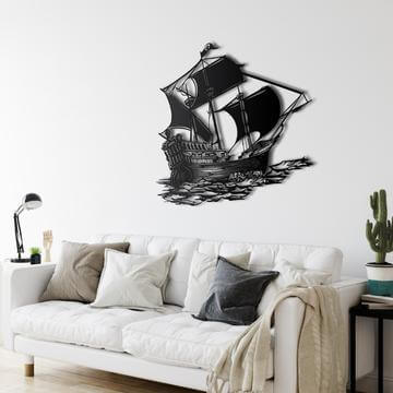
The walls are also important in creating a certain decoration. The different treatments you can do on a wall and it allow you to create a multidimensional effect. Furthermore, the correct positioning of paintings or metal wall arts allows you to increase this effect.
Use of Textures with Fabrics in Interior Design
One of the best resources decoration is undoubtedly fabrics. Their use allows you to give the right balance to a room without contrasts.
You can combine the fabrics in different colors or use different materials in the same shade. These solutions create depth in a simple way and with exceptional results.
When using different textures for fabrics, don't limit yourselve with cushions or sofas, feel free. All textiles in the room should participate in the "game of textures": curtains, carpets, upholstery, lampshades, etc.
You can combine velvet with linen or long-haired wool with shiny silk or synthetic leather. In any case it will perfect. The tendency to use the same fabric throughout the room is a very common decorating mistake. Don't be afraid of contrasts. Because, this is the secret to using the textures of the various materials correctly.
Lighting with Textures in Interior Design
Different fabrics interact with light by absorbing or emitting it. For example:
Smooth Textures
When you use smooth, reflective materials like satin or silk in a room, they reflect light. Thus, the room looks larger and brighter. Mirrors, shiny metallic elements and glossy wall paint can have the same effect. These materials can also make colors looks deeper and more saturated.

Rough Textures
The rough textures that absorb light are perfect for creating a comfortable feeling. For example, fabric or wool rugs make colors looks more soft and elegant. Unpolished stone or wood, frosted glass, and opaquel metal or paint will also make the space warmer.

Right Textures for Style in Interior Design
You can transform the look and feelings of the room with the texture and materials. For example:
Rustic Interiors
The key is to play with natural elements that absorb light, such as wood, stone and leather. Parquet floors, leather sofas, large cushions and soft rugs help to make the space warm and welcoming.
Luxury Style
If you want an eye-catching interior, use rich colors and textures to capture and reflect light. The soft velvet upholstery creates a wonderful luxury look. And the leather rugs add a refined sophistication to any space.
Modern Design
This style is defined by simple color combinations, reflective textures, and glossy materials. And this make the space more open and airy. Laser rugs combined with metallic elements can help you achieve a sleek and modern look.
The Effect of Materials in Interior Design
In general, the materials used in interior design are the mirror of the dynamism of design. Materials aren't just for filling empty places. They give an identity to these places.
A mirror, an original vase, elegant candles, wall decorations make a room more welcoming. Small or large home decorations are as important as furniture. With a careful selection of different home décor materials, you can truly change your home look, and existing furniture.
The spirit of a home shows through the materials used in the home. Get inspired by our selection: here are some ideas you can apply right away.
Entrance
The entrance practically is your home business card. So, use a mirror and an original piece of furniture to personalize.

Living Room
Place a tray on the coffee table, next to the sofa. Put different size vases, boxes and candle holders to create an atmosphere.
Bedroom
Get higher, your bedroom with bowls and jewelry box. Then add a gorgeous metal wall art decoration.

Study Room
Make your workplace enjoyable! With decorative objects for the home such as digital prints, and metal wall clocks.

The Effect Of Colors in Interior Design
You can create certain moods with colors or give rooms a whole new vibe. You must ensure the harmony of the different elements such as furniture, floors, ceilings, walls, doors, fixtures. If you know some basic rules of color theory, you can create different atmospheres in the environment.
Colors in Interior Design
Futhermore to the aesthetic effect, you can choose colors based on the positive or negative effects that color theory attributes to each.
Red is the color of passion and love
In the rooms, red should only be added as an impulse with little detail.

Orange is the color of optimism and joie de vivre
Orange rooms encourage social life and comfort. It is the ideal color for rooms with little natural light, kitchens and dining rooms.

Yellow is the color of the sun
Yellow makes small rooms look bigger. It is the ideal color for children's bedrooms and conference rooms. Because it promotes concentration, creativity and encourages conversation.

Green is the color of nature
In the rooms the green brings peace, safety and creativity. Perfect for study rooms.

Blue is the color of the sky
Small rooms look bigger with blue paint. You can use blue where you relax, especially in bedrooms.

Purple is the color of honor, mystical and protection
In rooms, purple has a calming effect, but is perfect for entrance.
Lilac and pink are the color of joy
Lilac and pink make you sensitive to the moods of others. Pink is perfect color for bedrooms as it calms and soothes.

White is the color of purity, clarity and innocence
It can be combined with any color. White is the ideal color combination in rooms.

Gray is the color of total neutrality and secrecy
Depending on the hue, gray can have different effects. In rooms, gray should only be used to combine with others color.
 ,
,
Black is the color of the night
It is widely used in the details of the industrial style. However, do not use on large surfaces as they will look dark and heavy.

Brown is the color of the soil
Soil tones such as okra and siena can be used in almost any room.

Gold is the color of power and wealth
Using gold color in home decaration is very chic. However it must be combined in the right way with the other accessories and colors of the room, and above all it must be dosed well.

Silver is the color of purification and harmony
The luster of silver really reflects other colors. It is the color of the modern, unconventional and original.

Whether they are calming or stimulating, colors have always had a strong influence on human and his well-being. Based on the theory of colors and on the definition of contrasts and harmonies between them, ceramic environments, flooring elements, stoves and fireplaces can give any environment a completely personal atmosphere.


Leave a comment